Statistics from our websites show that around 15-20% of users are viewing the site using smart phones and other handheld devices. This number is set to rise rapidly with the release of new mobile phones such as the iPhone 4GS.
Traditional websites are formatted for a larger computer screen meaning that when viewed from a smaller mobile screen the text is either unreadable (if you’re zoomed out) or you need to scroll horizontally (if you’re zoomed in); coupled with the fact that larger images may take longer to download, this does not give a good user experience.
Mobile websites are dedicated websites that are optimised for smaller screens. They are simplified, have a lower width and smaller images. This means that mobile users can read and navigate the mobile version far easier and quicker.
You often find that mobile versions have a different address and are prefixed with “m.” or “mobile.” rather than “www.”. Mobile versions should automatically detect the device that the user is using, and send you to the appropriate website version.
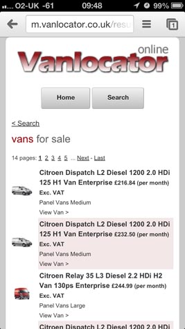
Case study: Consider the website www.vanlocator.co.uk, and also look at the mobile version m.vanlocator.co.uk (on a mobile device). The desktop site is a very large and complex example which doesn’t work well on mobile devices. The text is either small or requires a lot of horizontal scrolling. The mobile version on the other hand is far more streamline. The screenshots below are taken from an iPhone 3GS.
Webbed Feet UK make mobile websites in Salisbury and other areas in addition to smart phone apps.
They don’t cost as much as most people think, in fact they are usually far less than their desktop versions.
If you want to know more please do not hesitate in contacting Webbed Feet UK, mobile web developers in Salisbury.