Image sizing, you can't put a square peg in a round hole
Published on Friday, June 26th 2015 by Aaron Whiffin
The concept of cropping, letterboxing or skewing images is fairly complex, so I have written this as a reference article to explain the various options.
We all learnt at a young age the concept of putting a square peg in to a round hole; if a square peg will fit in a round hole then either:
- the square is significantly smaller that the circle and there will be four crescent-shaped gaps (this ‘letterboxing’ is shown on the left of figure 1 in grey), or
- the square is larger than the circle, it won’t fit, and bits of the square will need to be chopped off to make it fit (this ‘cropping’ is shown on the right of figure 1 in blue).
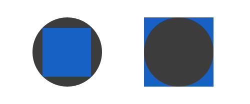
Figure 1
Note that there is also a third option where the square is medium-sized and there are both crescent-shaped spaces (grey) and bits to crop off (corners of square). This is shown in figure 2. For the purposes of this article we will ignore these hybrid solutions as they complicate things and are tricky to automate.
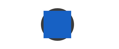
Figure 2
Rather than fitting a square peg in a round hole, in most cases online the issue is simpler; us web designers need to put a rectangular image inside a rectangular container. If the ratios of the rectangles are the same (i.e. they are the same shape) then this is easy; the problem occurs when they are different.
This happens more often than we’d like. Cameras take photos that are different shapes; a portrait picture (tall and narrow) will have a different ratio to a landscape picture (short and wide) and people crop photos and resize them themselves.
Typically photos have a 4:3 ratio; Consider figure 3, an image of my dog Flipper eating a (dog friendly) Easter egg. This image was originally 3264 pixels wide and 2448 pixels tall. This is the same aspect ratio (shape) as a rectangle that is 4 pixels wide and 3 pixels tall, as demonstrated by the red grid. So this image has an aspect ratio of 4:3. The copy on this article is smaller, 400 x 300 pixels, but again this has preserved the 4:3 aspect ratio.
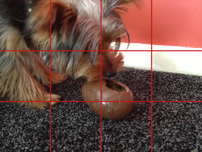
Figure 3
4:3 means that for every 4 units and image is wide, it will be 3 units tall.
Interestingly if the image were to be rotated 90 degrees so it’s portrait (rather than landscape) it would be 2448 pixels wide and 3264 pixels tall, and then the aspect ratio would be 3:4 not 4:3.
Similarly cast your mind back to older televisions; these typically were almost square and had an aspect ratio of 4:3. Then widescreen TVs became popular, which had an aspect ratio of 16:9. Even with HD TVs being invested, these typically still have a 16:9 ratio (albeit at a higher resolution).
To explain the issues with image resizing, I won’t use square pegs and round holes but will try and fit a rectangle (16:9) image in to a rectangle (4:3) hole; an issue that TV sets have had for some time.
Note that I am making the ‘hole’ 4:3 because this is still the typical dimensions for photos on the web. As an example, my iPhone takes images at 4:3, and sites such as AutoTrader (figure 4) still use this.
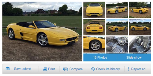
Figure 4
Consider the scenario where we want to constrain both the height and width of the containing rectangle. As you can see, AutoTrader have done this so that the 9 thumbnails and blue button bar all match up and form a nice grid-pattern with the main image.
This isn’t mandatory, they could just as easily
a) Fix a width and have variable height. But the issue with this will be that, in the event of a really tall (portrait) photo, the grey bar with “Save advert”, “Print” etc would be pushed down the page.
b) Fix a height and have variable width. But then with a wide photo there would be no space for the nine thumbnail images.
In short, by only fixing one dimension you can inadvertently impact on the design by adding images that are too long or too wide. Therefore it’s good common practice to fix both the height and width. There are of course always exceptions.
Let’s consider a container with a 4:3 aspect ratio, and a 16:9 (wide) image to put inside it. The image we shall use will be of a car (figure 5)
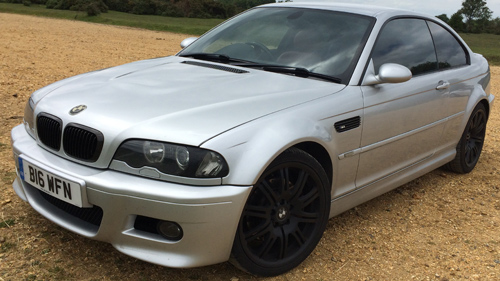
Figure 5 - Original image in 16:9
Excluding hybrid solutions, there are 3 ways in which this can be done:
- Reduce the size of the (widescreen) car so that it fits completely in to the 4:3 container. This will result in a gap at the top/bottom or left/right of the image/. This can be any colour and this instance I have used grey. This is known as ‘letterboxing’ and is shown in figure 6.
- Keep the original image the same size and cut off the oversized edges so that it fits in to the box. This is known as ‘cropping’. If there is a large background around the main feature on the image (such as fields or car park) this will work, but as you can see on figure 7, if the main feature (car) goes to the edge of the image, then parts may be missing (in this case the front and back of the car).
- Fit the image in to the box by adjusting its aspect ratio. This is ‘skewing’ and is shown in figure 8. As this distorts the image this is not usually the best method.
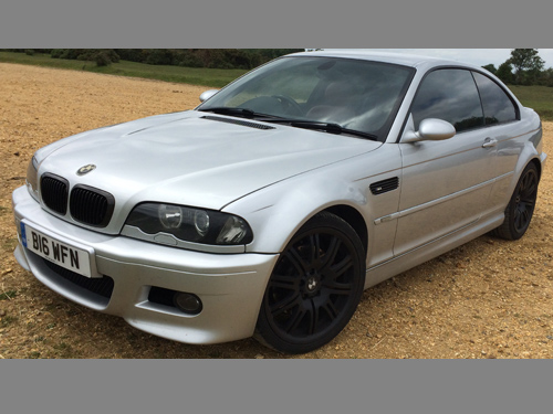
Figure 6 - Letterboxed image
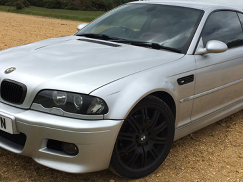
Figure 7 - Cropped image
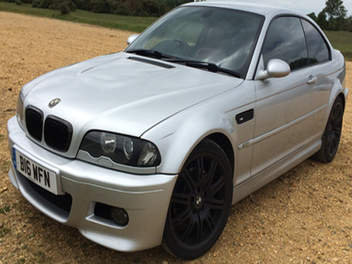
Figure 8 - Skewed image
Back to the TV analogy, several years ago when there was a 4:3 to widescreen (16:9) crossover, TVs allowed you to choose the resize method, and typically had a button that would switch between letterboxing, cropping and skewing.
In the car example above we have tried to put a wide image in to a narrower container, but the same holds true for putting taller images in to shorter containers.
For example putting a 4:3 portrait image (my nephew and I) in to a 4:3 landscape container, will look like figures 9 (letterbox), 10 (cropping) or 11 (skewing).
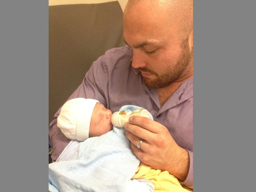
Figure 9 - Letterboxed image
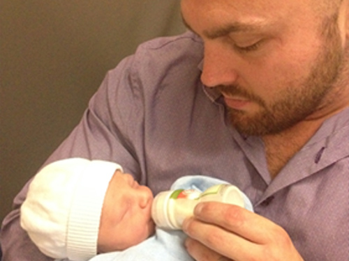
Figure 10 - Cropped image
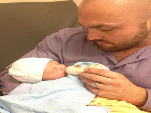
Figure 11 - Skewed image
In most cases it is usually best to use the letterbox method as it ensures that the entire image is displayed, and that it is not skewed. However in some instances this is not the case; for example with really wide or really tall images.
If a graphic designer is resizing images on an individual basis, each one can use a different method, or will likely be a combination of cropping and letterboxing. This however relies on the graphic designer knowing what parts of the images are the background and can be omitted, and which are essential parts of the image.
When automating this process it’s very difficult for a computer to make these choices, so in the vast majority of cases one of the above methods are chosen and will be used for all images.
AutoTrader do this in a pretty standard way, with a fixed height and width container, where the main image is letterboxed, and the thumbnails are cropped, and this is the method we’d recommend in most cases.
It should be worth noting that some systems allow users to manually adjust their images through a web-interface, but this method also has its drawbacks.
There is no easy way of fitting a square peg in to a round hole, and whichever way a web designer chooses with his client is likely to be a compromise in some situations.
The client can eliminate this problem by choosing photos that have the same aspect ratio as the container in the website, or at least reduce it by taking photos in a certain way, for example having a background area on images that are likely to be cropped.
It’s important that a client understands the differences between each method so can chose one that best suits their photographs, without impacting on the website’s design.
As a finishing not it would be worth mentioning mobile-friendly responsive websites. In these instances it’s possible for the fixed-sized container to be variable depending on the device and screen size that the user is using. This means that a lot more thought has to be put in to how this will work and which photos will be chosen. This however is likely to be covered in a future article.
We are web designers based in Salisbury, we are Webbed Feet UK.
 01722 346400
