Top 5 mistakes made on tour company websites
Published on Wednesday, January 7th 2015 by Alex Hopson
If you’re finding you aren’t getting the traffic or sales from your tour company website then you may be making one of the top mistakes. These mistakes make your website less likely to be found and used by potential customers, and those visitors that do make are less likely to convert into a sale.
Making it hard for users to read
You don’t want pages of meandering prose, you need to make sure your text content is focussed, easy to scan and split into bite sized pieces of information. When you describe a tour ensure that the key destinations and activities are highlighted so people can quickly pick out the key facts about your tour. Have a succinct introduction that sums up the tour, and if you have several similar tours be sure to highlight the differences between the tours – you don’t want to paralyze people with choice.
Most websites these days are content managed which means you can edit the content yourself rather than relying on your website designer. When writing content you should look to create clear, easily digested text that includes your keywords for search engines.
No clear action to take
If a potential customer is considering one of your tours you need to make it as easy as possible for them to book it. Every second they spend looking for your contact details or booking form increases the chances they’ll get bored and move on to another site, users are increasingly fickle and easily distracted.
I’d recommend making sure that your phone number and email are visible on every page in the header or footer, and the contact page is clearly listed in your navigation. It’s also crucial that you have a button to book tours on each tour page, and make sure that button really stands out – use a dominant colour and plenty of white space – so that users will see it. Make sure that the design of your website isn’t ‘noisy’ so that the important calls to action are lost in a sea of bright colours and graphical detail.

The layout of this site is a mess, with no obvious next action. There are two menus filling up the right hand side of the screen making it hard to scan, and the main action to get people to browse the tours is in one of a number of identical boxes with the same visual 'weight' but of much lower importance.
Putting obstacles in the way of visitors
Each click a user has to make or bit of information they have to fill in increases the likelihood they will go elsewhere. Splash pages are just a waste of your visitors’ time, and pop up messages they need to dismiss are a nuisance (especially on mobiles). You will lose some visitors at each obstacle, so minimise the obstacles you place in front of them.
On your contact and tour booking forms reduce the forms to the minimum information you actually need. This is especially true on booking forms, ask for the users basic contact details, the number of guests and the tour they want to book, then take them straight to the payment page. If you need the names and requirements of each guest then ask for that after you’ve taken the payment.
If you have a lot of tours it’s crucial to ensure that users can drill down to the tours they are interested in as easily as possible. Make it easy to filter tours by destination, price, activity level and duration. Ensure that your navigation is clear and logically structured. Potential customers won’t spend long trying to find what they want before they go somewhere else.

The nagging popup - a great way to annoy users and make your site harder to use!
Not optimising your site for mobiles and tablets
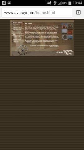 The exact amount of users using mobiles and tablets will vary from site to site, but it’s close approaching half of all users on average now. If your site doesn’t display correctly on a mobile people will just bounce and go elsewhere only the very determined will stay and struggle through zooming in and panning around the page. Just take a look at the example on the right and see hard hard to read and use this site will be.
Take a look at your analytics, and if you don’t have analytics you can add that to the list of mistakes! Analytics will show you how many people used mobiles (go to Audience -> Mobile -> Overview) and see how you site compares. Also take a look at the bounce rate and see how that differs between mobile and desktop, if it’s much higher for mobile then you need to look at why you are losing mobiles visitors.
Not looking professional
In the short time the web has been around, technologies and design styles have changed on an almost annual basis. If your website was designed more than a few years old there’s a good chance it’s looking dated. People are quick to judge websites so it’s important you come across as professional.
People buying tours are usually spending a significant amount of money on something they will not experience until they have put their money on the line. It’s critical that you allay any fears that you are not professional or reliable. An old or, worse, broken, website will set of warning alarms in users heads.
Make sure that you provide your contact details and address and this is an important trust signal. If you are a member of any professional organisations, ABTA for example, you should prominently display this.
That’s the worst of it
These are five of the most important mistakes, if your website is guilty of any of them then spending the time to fix them will quickly pay for itself. Even if you have addressed all these mistakes there’s always room to improve conversions, or work on getting more traffic to your site through search engines or online marketing,
Webbed Feet UK specialise in creating websites for tour companies, we’ve been designing sites for the travel industry since 2001 and have seen the industry shift online. In this time we’ve helped our clients get more traffic and convert more visitors into customers.
If you’d like to discuss your site, or how you could improve it, we’d be happy to chat with you, just give us a call on 01722 346400.
 01722 346400
